Monday, December 9, 2013

Ken Price - a remarkable sculptor AND painter


Late Sept, I was fortunate to see the 50-year Retrospective of Ken Price at the Metropolitan Museum of Art in New York City.  My impression of what is and what could be sculpture art has forever changed. 

This one year traveling retrospective show began a year earlier at the Los Angeles County Museum of Art.  The planning for the show started much earlier dated back in 2009.  Price himself was personally involved in the details of putting up the show.  Sadly, he passed away in Feb 2012 before the show was open and the retrospective became a memorial show.  But we can be certain is that the lighting, the placement, the selection and arrangement of his works is exactly how Price had wanted to communicate with us.


I didn’t know who Ken Price was nor did I know anything about his work prior to seeing this retrospective of his.   For that matter, I didn’t know much about sculpture art beyond what are typically displayed and shown in major museums, public spaces, and sculpture parks.   Yes, I have been shaken by so many powerful realistic figures by Rodin.  Yes, I have been admiring the semi-abstract monochromatic figural forms of Henry Moore’s and Constantin Brâncuși’s.  Yes, the 3-dimensional excursions of top modern artists like Picasso, Matisse, Miró displayed the prowess of these unusual talents. Yes, I have also been awed by abstract gigantic contemporary works from massive monotone minimalist steels of Richard Serra to intricate and delicate union of ordinary daily objects by Sarah Sze.  But none of them makes me pause, turn back, look, and think again, like Price did.  And Price’s works are like no one before him.

Ken Price’s retrospective was arranged in reverse chronological order to deliver the max punch.  However as I unknowingly entered the gallery from the opposite door, I ended up viewing his works in chronological order like most retrospectives. I retraced his foot steps forward and took in his breakthroughs bit by bit.  As one enters the first (or more correctly, the last) room of the gallery, one is met with his early glazed ceramics.  They range from simple cups and mugs to more abstract pieces. Some of cups and mugs incorporated realistic figures like snail and turtle.  A particularly interesting one is his 1968 Blind Sea Turtle Cup in a wooden tray filled with sand (photo to the right).  Not sure what the word Blind refers to but the arrangement reminds me of Japanese Zen garden.  Can the sea turtle see where he is going or he just instinctively knew, oblivious of the big cup he is carrying?
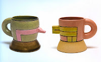
Some of the ceramics like his 1968-69 nose cups are more abstract (photo at the right).  Opposite of the cup handle, there is an extruding nose form which makes the cup more ambiguous – is it a cup or a kettle? Next to the gallery walls in cabinets and shelves are Price’s series Happy Curious: ceramic vessels that display strong influence of North American Indian’s in terms of color, form, feature as well as pattern.  One can imagine these works must be inspired by Price’s first visit to Taos in New Mexico to where he eventually relocated.

I learned there and then from my sculptor friend that ceramics had not been taken as a serious art until Ken Price, his lifelong friend Billy Al Bengston and their teacher Peter Voulkos changed this traditional view for good with their works.  To challenge a long tradition is never a small feat even for independent minded originals like Ken Price.  To understand what it was like, Price once said “When I grew up, sculpture wasn’t supposed to be colored. It was supposed to reflect the inherent material it was made out of.  It was called ‘truth in materials,’ and there were lots of other tenants like it.”

Ken Price’s early works gave us some hints of his explorations and discoveries in his career later.  He showed that ceramics can be art in its own right.  While the technique of much of his early works was the traditional glazed ceramics, their colors and compositions on the vessels are often just like what one finds in abstract paintings.   Indeed, colors do not have to flow or fuse into each other like many traditional ceramics that seek fluidity and harmony.  Rather, orange, pink, and green can occupy their own space and interact with each other that clearly demonstrated Price’s urge to break free from the tradition.

There are also a few peculiar works including one at the center of the room that draws every visitor’s attention.  These are small ceramic works sitting on cushions and large pedestals.  The choice of the color, form and the title of the series Specimen speak directly to its sexual and erotic content.  On display in the next room are a number of works from his series egg in about the same period.  They are all shaped like eggs.  The sexual message from Specimen continues as some of the eggs have slug and tongue looking form(s) coming out of interior of the egg.   There are abstract paintings on the eggs.  The colors are bright and saturated, predominantly in primary colors.  These are now ceramics painted with lacquer and acrylics.  By not glazing the ceramics and painting them instead, Price appeared to have freed himself and found more degrees of freedom in his creative process working with ceramics. 
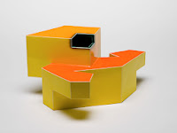
Many of Price’s early non-glazed works had distinct features of landscape and architectures although the titles suggest some of them were abstract cups (see photo at left).   The elements often come with smooth flat surface juxtaposed like Lego and puzzles to form a particular shape.  The material is still clay; some are glazed ceramics and some are fired and painted clay.   Each surface has a monochromatic but saturated color which contrast and emphasize each other.  When pushing this idea to the limit, some of the works can be argued to exhibit influence of cubism.  For example, Price’s 1983 abstract figural works entitled 
1914 (photo at right) and 1917 remind me of Duchamp’s Nude descending a Staircase.  

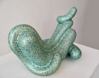
In a way, it is good that Price did not go in that direction any further.  Instead he completely stopped using glazing and made the most unique and amazing sculpture works in next thirty years of his life till his death.  Price returned with a vengeance to the lumps, bumps and blobs that he started with in 1950’s as seen his 1959 work Avocado Mountain (see photo at right).
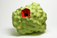
With fired and painted clay, Price started the conversations of smooth painterly and rough lumpy surfaces like in his 1986 The Pinkest and the Heaviest (photo at left) and his 1987 work Orange.  The conversation did not end at the surface and curves; colors are as critical.  Often the choice is complementary colors like in his 1995 work Patel (see photo at right) or primary like in his 1989 work Untitled.   Added to the mystery, most of these works have a void where multiple flat surfaces met that begs the question that is it a physical hole or a visual illusion?  It also brings back the images of his specimen and eggs 20 sitting feet away as some of which also have black holes.  It turns out that they are indeed physical void and there is no illusion about it.  Is he humoring us or is he telling us that the inside and outside of a 3-D sculpture is equally meaningful and important? 


As Price leaping forward, flat surface disappeared and eventually the holes were gone as well.  What is left are connected and interacting forms like in his 2005 100% Pure and 2011 Zizi (photos above; can you guess from the titles which is which?).  The size has grown considerably after he built a large kiln in his studio.  No matter from which angle you are looking at, these forms are graceful, simple with yet “fast and slow” curves and unexpected folds.  His 2000 Hunchback of Venice (photo at right) in particular, allows one view the sculpture from the bottom as well which is truly an unusual experience.  In fact many of them them are so inviting that one feels like to hug them. 

The magic did not end there.  Even more astonishing is the complexity and interaction of colors presented on their surfacesStanding at distance, it produces an effect not unlike what pointillism did over one hundred years ago.  Standing close to the surface, one sees incredibly rich shapes of varying, dazzling and dancing colors (see the closed-up photo at right of a portion of Price's 2008 sculpture Vona)).

The particular technique was developed and perfected by Price over the last ten years or so of his life. He created sequenced color charts and painted layers of acrylics on the surface with black at the bottom layer.  Some of the works have as many as 15 colors with 5 layers each.  He then repeatedly fired and removed parts of the top layers of colors selectively to reveal the colors of layers underneath. The removal was accomplished by sanding down the surface, or using Q-tips or cloth soaked in denatured alcohol to dissolve the paint.  The resulting colors and patterns are so rich and dynamic that the works appear to be made by not mortals but natural forces.

What is amazing is the sense of the depth of the object delivered by such painted surfaces.  Robert Irwin had the following to say: “Kenny Price was the first and still the best contemporary sculptor to employ the full power of color: its physicality, its weight, density, and unique ability to articulate form and feelings. Looking at Kenny’s work, you were always touched by the color and the unique feeling that if you were to break one of his works in half, it would be the same intense color all the way through.

Price did explore the effect of light like painters also.  He employed iridescent surface and used translucent Murano paints that have reflective glass particles to address the question “is reflection property of light or in color itself?”   Throughout his life, Price worked almost exclusively with clay. By making his clay sculpture appear to be made of colors, Price has succeeded in ridding off the demon when he began his career that “sculpture wasn’t supposed to be colored”.  He also firmly delineated the art from craft: “A craftsman knows what he’s going to make and an artist doesn’t know what he’s going to make, or what the finished product is going to look like”.

As I chew on more and more with his works, I suddenly realized that, with our limited vocabulary, Price is actually both a sculptor and a painter.  The former has traditionally deal with form, shape, curve, texture, and volume while the latter with perspective, shape, color, value, and light.  By treating color and light as an integral part of sculpture, Price has created essentially, in language of painters, a whole new type of canvas in 3-D (through topological transformation, in Mathematician’s language) and made painted on them additively and subtractively.  There was no one like him before and I am certain his works will be remembered and treasured forever.

Talk to you soon!


Wednesday, November 13, 2013

Landscape is Sculpture


Most of us grow up, live, and work in boxes throughout our whole life.   Some of us are lucky enough to have space around or near our boxes, be it private, shared, or public.   We call people who design, arrange, and modify the appearance of the spaces landscaper.   As its focus is on the visual features of a space, landscaping naturally lends itself to visual art and it has incorporated sculptures traditionally. Yet, artists don’t usually work with landscaping for one reason or other and we don't usually think of a landscape as a whole an art.  Further, the mentioning of the word of sculpture usually brings one the traditional image of a three dimensional object such as a statue or a vessel etc.  

An hour north of New York City, there is a less known, small but fabulous museum called DIA: Beacon on the east bank of Hudson River.  The museum was open 10 years ago after private citizens, non-profit organizations, and state and local government came together to make the conversion happen of this 300,000 square foot 1929 former box printing factory of Nabisco's.  In addition to some spectacular collections as one expects with a major museum, what makes this museum special is its garden, its parking lot as well as the all natural lights in most galleries, respecting and preserving much of the original factory layout.  All this was made possible due to the effort of one of the most influence contemporary American artists Robert Irwin, a pioneer of the Light and Space movement of the 1960's. (For a more complete account of the design, see Chap 22 of Lawence Weschler's 2009 book Seeing is Forgetting the Name of the Thing one Sees: expanded edition.)

As one drove down the road and entered the parking lot, one was not greeted by usual rows of boring metal boxes called vehicles in English speaking world.  Rather, one sees a painting.  A painting in a large canvas of crabapples groves interspersed with randomly colored boxes which are floating and waving above ornament grasses at the whispers of wind.   

As one being led by allée of trees towards to the museum entrance, one’s eyes get attracted to this large tall boxy green object at the right.  Looking closer, one would realize it is composed of four quadrants of 3 by 3 neatly trimmed Blue beeches (American hornbeams) that are slightly taller than the building right next to it.  One can enter and wonder around these hornbeams using the slightly elevated dark grey deck.  The trees are spaced dense enough to form a shadowy green box and yet sparse enough to let light leak through onto each other and at times, all the way reaching the ground.  If you stand back a little, with the supporting cor-ten of the deck and sharp edges of the trimmed trees, the whole structure appears to be extending out of the building that claims its permanency like the building itself.

Is it a landscape? a garden? Is it an sculpture however temporal it is?  How does it change its appearance through the hours of day, the season as it is organic? Walking on the deck and wondering around the trees, you touch light, air, and the earth.  You are experiencing a living sculpture and you feel the life.  What an amazing piece of art work. Thank you! Robert Irwin.  You have shown us what a landscape can be and how it can alter the space and our experience beyond its own existence.

Driving a little more than 10 miles south from DIA: Beacon, one arrives at the Storm King Art Center, a magnificent 500 acres sculpture park. At the southern end of the park, one comes to meet Maya Lin’s Wavefield.  It accentuates the hills and mountains in its backdrop, near and far, sprinkled with the fall colors.  It draws you in and takes you up and down the ridges. It seduces you to roll down hills and smell the grass and earth like children.  It has the similar effects as her Vietnam Memorial in Washington D.C.: it does not intrude nor divide. It harmonizes us and nature, the living and the immobile.  It makes you introspect and reflect, not conquer.

Circling back north, one sees the eastern part of the dry stone wall by Andy Goldsworthy (entitled Five Men, Seventeen Days, Fifteen Boulders, One Wall).  It rises up from the bottom of a lake and snakes its way uphill through woods.   Size wise, it is dwarfed by the 2000+ years old Great Wall of China which nevertheless couldn’t protect the last emperor of Ming Dynasty from his own dismal performance and the betrayal of his own general.  As one walks across an opening of the wall, one wonders which is inside and which is outside the wall?  Is the wall keeping someone out or keeping someone in?

As one reaches the top of the hill at north of the park museum, Isamu Noguchi’s Momotarō invites you to sit down on its bench like granite to pause and to look around.  If you can’t resist the temptation, you can climb into the halved peach shape boulder to experience the legend of how Momotarō was born.  Noguchi had the following to say about creative process: “You can find out how to do something and then do it or do something and then find out what you did.”   The idea of Momotarō was more than likely born only after he split the granite.   In contrast, Irwin’s DIA: beacon garden and Lin’s wavefield were clearly created deliberately after much meditation and thoughts.   

Regardless the creative process, Noguchi had in fact thought of landscape as sculpture long time ago.  In his 1968 book A Sculptor’s World, Noguchi said " I like to think of gardens as sculpturing of space: a beginning, and a groping to another level of sculptural experience and use: a total sculpture space experience beyond individual sculptures. A man may enter such a space: it is in scale with him; it is real. An empty space has no visual dimension or significance. Scale and meaning enter when some thoughtful object or line is introduced.  This is why sculptures, or rather sculptural objects, create space.”  I saw three sculptures at two places in one day.  Would Noguchi be disappointed?

Talk to you soon!

Saturday, March 2, 2013

On Perspective


In my last blog, I touched upon Picasso’s choice of not pursuing further and total abstraction back in 1911.  Instead, he took a different path and retained some figural representation in his works that shaped cubism and influenced development of modern arts.  Still, many of these paintings are not easy to comprehend.

One reason and an important technique found in cubism and modern arts is the use of multiple perspectives. That is, a painting can be composed of multiple views of one or more objects on the same canvas.  As a result, an object could be broken up with each fragment being represented in different perspectives and placed once or multiple times on the canvas.

Equipped with the ability to recognize figurative representation of familiar objects, be it ultra realistic, or partially abstract, we can still identify some of these scattered fragments without too much difficulty.  However, at first sight, the resulting paintings look odd since they defy our visual experience of the straightforward single perspective or snapshot view.  There are many such examples including Picasso’s 1918 Harlequin, his later Surrealism works including the 1937 Weeping Woman and the 1952 Girl in Chair (see photos below, from left o right). 


Note each part of the human figure subject appeared only once in these paintings, regardless how out-of-place it may be.  It is then not a huge leap to having multiple views of the same part of a figure that appear on the same canvas simultaneously as shown in his work 1938 Head (see photo to the right)

Similarly, Marcel Duchamp’s 1912 work Nude Descending a Staircase, No. 2 (see photo to the right) is also not difficult to decode.  It brought even more directly the fourth-dimension, namely, time into painting using multiple perspectives (over time, in this case).  The canvas can obviously be thought of as an overlay of successive frames of a motion picture from a fixed vintage point in which the subject walks down a staircase.  

A little digression is in order.  One obvious motivation for drawing and painting in human history has been to record and to represent what one has seen through their eyes.  To that end, the first value judgment of such a record would naturally be the accuracy of it, or how “realistic” is the painting compared to our experience.  No wonder Leonardo Da Vinci had famously said “The most praiseworthy form of painting is the one that most resembles what it imitates.”  That is exactly what the artists in Renaissance were striving for 600 years ago – they wanted to make the painted scenes look as natural and real to the viewers as possible. 

Renaissance artists’ solution to this challenge was Linear Perspective.  It was developed in Florence, Italy in early 1400’s whereby artists paint the objects as they appear on an “imaginary window” in between the viewer and the field of objects.  More precisely, if one draws a straight line between a point of the actual object and his/her eyes, the intersection of this line and the imaginary window should be the location of the corresponding representative point of the object on the canvas.  Below is a popular example - the painting Ideal City by Piero della Francesca.


A consequence of this viewer-centric projection method is that objects further away from the viewer would appear smaller and parallel tracks appear to converge into a point at infinity, the so called vanishing point.  However as the viewing angle becomes wider and exceeds more than say 60 degrees such as in some landscape paintings, it becomes difficult to represent accurately what our eyes see in a two dimensional flat surface.  Camera fisheye lenses are photographer’s solution to this problem with a nonlinear projection that carries a significant distortion.

Technically and strictly speaking, there is no single or completely accurate representation that works universally.  For one, we are talking about placing faithfully the details and relationships of all objects in a three- or four-dimensional space (or space-time) onto a finite 2-dimensional canvas.  Further, viewer’s eyes are known to wonder around the picture, consciously or unconsciously, and their brains do produce varying responses depending on the order of and how the stimuli are presented.  Artists can express and communicate more effectively if they can influence how viewers view and respond to their works.  That is why perspective matters.

The implication of the viewer-centric perspectives such as the linear perspective is that the viewer naturally responds to and interacts with the painting from outside the painting.  An alternate choice of the representation is the parallel system by which projection rays are parallel to each other.  Such a system in fact has been used earlier in Western and in many cultures/civilizations.  In fact it was used extensively in Chinese paintings for thousands of years.  Below are two examples from a recent paper by Christopher W. Tyler and Chien-Chung Chen. The photo on the left is Gu Hong-zhong’s 顧閎中classic painting Han Xi-zai Gives a Banquet (韓熙載夜宴圖) during Five Dynasties 五代 (907~ 950 AD).  On the right is a wall painting of a Roman bakery from the 1st century found in Pompei.  For more detailed discussions, one can refer to the paper Chinese perspective as a rational system: Relationship to Panofsky’s symbolic form which was published on Chinese Journal of Psychology, Volume 53, Issue 4, Pages 371-470, December 2011. 

The significance of what parallel system offers, in contrast to that of linear (or non-linear, for the matter) perspective, is the object-centricity and viewer-independence.  One no longer relates to the painting through an invisible viewing window external to it.  Instead, one can be inside the painting and does not have a fixed physical view.  The beauty is that once removed from the viewer-centricity constraint, artists can express freely their own feelings, experiences, and imaginations, be it real or unreal.  They don’t have to maintain consistent views of all objects simultaneously from a fixed external viewer’s point of view!  One result of it is the scene may appear odd and obscure, and may not conform to our daily experiences.  But who is to say one must be realistic and adhere to the linear perspective of the Renaissance’s?  On the right, you can see the photo of one of the most revered classical Chinese landscape paintings.  It is entitled Travellers among Mountains and Streams (谿山行旅) and was painted with ink and slight color on a 6¾ ft x 2½ ft silk scroll by Fan Kuan 范寬  It is not realistic by the measure of  linear perspective but nevertheless a beautiful painting! 


I would submit to you that for this reason, parallel and mixed representational system with multiple perspectives are often found in Cubism and other 20th century modern arts.  The brilliant contemporary British artist David Hockney has made in-depth expositions on the topics of perspective.   In his 2012 interview with Martin Gayford first published on The Daily Telegraph, Hockney was quoted to have said:  “Cubism was an attack on the perspective that had been known and used for 500 years. It was the first big, big change. It confused people: they said, ‘Things don’t look like that!’ Actually cubism was concerned to claim: yes they do in a way.”  He then went on and added that “In Picasso’s pictures you can see the front and back of a person simultaneously. That means you’ve walked round them. It’s a sort of memory picture; we make pictures like that in our heads.”  

David Hockey’s photo collages and composite Polaroid pictures as he first re-examined Cubism back in 1980s are excellent examples of the importance and endless possibilities of distinct perspective.  Below are two of these collages on http://www.hockneypictures.com are included here for your convenience.  The one on the left is his 1983 work Walking in the Zen Garden, Ryoanji Temple in Kyoto.  The one on the right is his 1982 composite Polaroid photos Don & Christopher


With it, you would not be surprised then to hear that Hockey has been quite intrigued by the classical Chinese scroll paintings as they addressed some of the very issue of perspective in its own unique approach.   In scroll painting, in addition to using stationary single or multiple perspectives, the representation of four-dimension time-space relations on a two dimension space is accomplished by continuously shifting the perspective with changing vintage point from right to left.  As one views only a small and a few feet wide portion of a seemingly endless scroll at a time, the viewer is no longer bounded by a fixed and bounded window – one of the very constraints that Dave Hockney was trying to remove in conventional western painting and photography.

Below is a brief segment of the 47 minutes long 1988 documentary film entitled " A Day on the Grand Canal with the Emperor of China" by David Hockney and Philip Haas that discusses aspects of Perspective in Chinese Scroll Painting.  The subject is the late 17th century scroll painting The Kangxi Emperor’s Southern Inspection Tour 康熙南巡图by Wang Hui王翚 and his team.   It is a series of twelve massive hand scrolls, each one measuring from forty to eighty feet in length!  The techniques of multiple simultaneous perspectives and parallel system combined with shifting perspective can clearly be seen throughout.  The first 10 minutes of the documentary is available on Youtube.  (https://www.youtube.com/watch?v=nmMasnL5VZg).  Enjoy them by just wondering around in the scenes and don't worry about the realism and don't try to view it from your imaginary external window!


Hope you find the subject of perspective fascinating which is found in many fields beyond arts including computer graphics.  It definitely helped me understand better the history and techniques in both Western and Chinese Arts.  Talk to you soon!


Sunday, February 24, 2013

Inventing Abstraction


When meeting an abstract painting, my first reaction is usually “What are you saying?!”   When I attempted an abstract painting for the first time, it dawned on me that I did not even know where to begin; it is so much easier to paint something real.  Why is it so hard to appreciate abstract art?

My Aha moment came when we went to the exhibition Inventing Abstraction, 1910–1925 at the MoMA (Museum of Modern Art) in New York on Feb 17th on the 100th anniversary of the legendary 1913 Armory Show in New York City when modern European art was first introduced to the public in United States.

As one walks into the gallery of this special exhibit on MoMA’s top floor, you are greeted by a 1910 painting of the master artist Pablo Picasso (see photo below on the left, sourced from Google Image).  If you try to search for a clue to figure out the subject of this painting, you may barely identify an object at the lower center of the painting that looks like a mandolin.  The rest of the painting however looks more like mumble jumbles no matter how pleasing and appealing to our visual senses.   If I tell you the title of this painting is “Woman with a Mandolin”, you may possibly convince yourself and others, after the fact, that the forms and lines above and behind the mandolin could be a woman figure (could it be a man?).   If I show you a pre-cursor entitled “Girl with a Mandolin” that Picasso had done earlier in that Spring of 1910 (see photo below on the right), does everything make more sense to you now? 


It became clear to me then that the main reason I could not decode completely this important work (and most other abstract paintings) because there is almost nothing in the painting looks familiar to me (based on MY knowledge and experience.)    That is, if the artist and I do not share similar experience and can’t communicate in some common languages, and if there is no supplemental information or “translation”, how could I possibly hope to understand what the artist is saying through his/her work?  Indeed how is this any different from other situations when we are confronted with something foreign and outside of our expertise or experience?  With such a realization, I no longer feel intimidated.  I realized that I can in fact do better.  I can learn a little more the context and the language of the artists to communicate with them through their work.

The painting “Woman with a Mandolin” was fittingly placed at the entrance of this exhibition because it was a bifurcation point in Western modern art.  It represents the furthest Picasso had gone in his works in terms of the level of abstraction. While many artists had continued to pursue abstraction in various ways at the time, Picasso chose instead to add back more (fragments) of figurative representations (or what he called “attributes”) to his subsequent works including those that defined Cubism, the most influential art movement of 20th century.  One of his famous quotes was that “There is no abstract art. You must always start with something.”  Many art historians had noted that Picasso believed strongly in maintaining the connection between his work and the things in real world.  

Turning to the right after viewing Picasso’s “Woman with a Mandolin”, one sees another historical painting - Wassily Kandinsky’s 1911 “Impression III (Concert)” (see photo on the right, sourced from Google Image).  Again, if you did not know the title nor the context of the work, it would be extremely difficult to guess what the objects of the painting represent.  With the help of the title, most viewers would probably have guessed correctly the large black form in the painting is a piano and those smaller slim figures are orchestra and the audience. 

But what about the big yellow patch that takes up almost a third of the canvas?   It turns out this warm bright color depicts Arnold Schoenberg’s music.  Kandinsky, being the leading theorist advocating abstraction at the time, had actually been struggling to create abstract painting.  The breakthrough came when he attended the concert of Schoenberg’s Second String Quartet Op. 10  in Munich on Jan.2nd, 1911.  What Schoenberg had achieved and demonstrated was a new type of music that is atonal.  In particular, the last movement of this string quartet has no key signature and is devoid of diatonic harmonies found in traditional music (thus again, unfamiliar to most).  Inspired by the new style, Kandinsky sketched out that evening the painting Impression III (Concert) that demonstrated abstract visual presentation of color, form and lines can be “ just as abstract, emotional, and spiritual as Schoenberg's music!”  How is this any different from the story that Steve Chu got the idea of his Nobel Prize work in cooling and trapping atoms with laser light when he saw snow flakes coming down from his office window at the Bell Labs?

One might question what is left if one pushes the process of abstraction to the limit through reduction, simplification and indirection?  Some artists did exactly that.  Not only narratives can be absent, colors can be removed, forms can be reduced, lines can be dropped, and title can be “untitled”.  In this exhibit, Russian Suprematist Kazimir Malevich’s 1918 painting White on White serves a good illustration of abstract works that show “pure artistic feeling rather than on visual depiction of objects”.  How far is it from the ultimate “nothing represents nothing”?

Nelson Goodman discussed the term abstract on Grove Art Online: “Since an abstract work is one without representation, or more generally denotation, the question naturally arises what an abstract verbal or linguistic work may be, a text that says nothing, a story that does not tell a story, a poem that does not speak of anything. Like a picture that does not picture, these works are deprived of a normal denotative function and refer directly by showing rather than saying, as by exemplifying patterns or expressing feelings…”  As a student of art, I certainly feel more comfortable with Picasso’s ideas on abstraction.  If ALL familiar forms are removed and the links to figurative representation of objects are absent, what are we left with?   What and how could I communicate beyond the mere raw emotion with others through the work?

Of course, abstract art in a broader sense is not new and has been in existence since the early days of the human history.  It has been and continues to be reinvented all the time in many corners of the earth in varying contexts, media with different tools.  One example is a recent calligraphy work by Dong YangZi 董陽孜in Taiwan (see photo below).   Can you tell what the characters are?  How critical is it?  I was told that Art comes first!  Indeed, it is no different from in music where music comes first.  How critical is the lyrics when you first hear a song that touches your nerves and evoked your unknown emotions?  Did you enjoy some Italian operas any less because you did not understand Italian?


What I have also learned from the exhibit is that the development of abstract art did not happen as a result of few geniuses dreamed up an approach and style in isolation from their studios.  The opposite was true.  The creative process was not unlike today’s races in bleeding edge applied science and technology.  Artists discussed and debated each other in bars, café and by mail from concept, theory to experiment.  They stood on the shoulders of masters like Paul Cézanne and challenged the tradition and the status-quo.  They explored and experimented; they competed and pushed each other to the brink.  Their social networks were not limited to fellow artists as illustrated in the chart to the right from the exhibit. They included poets, writers, composers and tool inventors, a true inter-disciplinary venture as what we might call it today.  Whether you feel comfortable with abstract art, I think you would agree that it was an exciting period in history.  I think you will enjoy it more and more as you spend more time with it.

Talk to you soon!